- Power BI forums
- Updates
- News & Announcements
- Get Help with Power BI
- Desktop
- Service
- Report Server
- Power Query
- Mobile Apps
- Developer
- DAX Commands and Tips
- Custom Visuals Development Discussion
- Health and Life Sciences
- Power BI Spanish forums
- Translated Spanish Desktop
- Power Platform Integration - Better Together!
- Power Platform Integrations (Read-only)
- Power Platform and Dynamics 365 Integrations (Read-only)
- Training and Consulting
- Instructor Led Training
- Dashboard in a Day for Women, by Women
- Galleries
- Community Connections & How-To Videos
- COVID-19 Data Stories Gallery
- Themes Gallery
- Data Stories Gallery
- R Script Showcase
- Webinars and Video Gallery
- Quick Measures Gallery
- 2021 MSBizAppsSummit Gallery
- 2020 MSBizAppsSummit Gallery
- 2019 MSBizAppsSummit Gallery
- Events
- Ideas
- Custom Visuals Ideas
- Issues
- Issues
- Events
- Upcoming Events
- Community Blog
- Power BI Community Blog
- Custom Visuals Community Blog
- Community Support
- Community Accounts & Registration
- Using the Community
- Community Feedback
Register now to learn Fabric in free live sessions led by the best Microsoft experts. From Apr 16 to May 9, in English and Spanish.
- Power BI forums
- Forums
- Get Help with Power BI
- Desktop
- Re: Career growth path
- Subscribe to RSS Feed
- Mark Topic as New
- Mark Topic as Read
- Float this Topic for Current User
- Bookmark
- Subscribe
- Printer Friendly Page
- Mark as New
- Bookmark
- Subscribe
- Mute
- Subscribe to RSS Feed
- Permalink
- Report Inappropriate Content
Career growth path
Hi all,
For my internship i've been asked to show some HR information in a Power BI dashboard.
One of the assignments is to show a 'career path', an example of this:
An employee has several knowledges (Azure, SQl etc.) and got some competences (leader, teamwork etc.), now he is fulfilling the role as System Engineer 1st line.
But in the future he wants to be a System engineer 2nd line, to become a 2nd line s.e. he needs other competences and knowledges.
You guys gut any ideas how to show this in a graph? Hope i made my example clear enough, thanks for helping.
Solved! Go to Solution.
- Mark as New
- Bookmark
- Subscribe
- Mute
- Subscribe to RSS Feed
- Permalink
- Report Inappropriate Content
Hi @miltenburger,
I used below sample to test. I renamed some field names in order to distinguish.
Create a calculated table.
New table_1 = CROSSJOIN(VALUES('Employee Knowledge'[Employee]),'Function Knowledge')
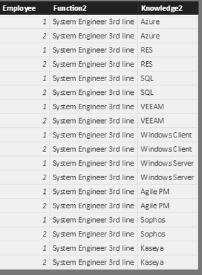
Based on 'New table_1' and 'Employee Knowledge', filter out those unmatched records which shows knowledges an employee have to learn to become a 3rd line.
New table_2 =
EXCEPT (
    SELECTCOLUMNS (
        'New table_1',
        "EmployeeNo2", 'New table_1'[Employee],
        "Knowledge2", 'New table_1'[Knowledge2]
    ),
    SELECTCOLUMNS (
        'Employee Knowledge',
        "EmployeeNo", 'Employee Knowledge'[Employee],
        "Knowledge1", 'Employee Knowledge'[Knowledge1]
    )
)
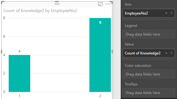
I would suggest you use a table visual to display above information. A chart cannot show knowledge details, while it can show how many knowledge an employee need to learn in the future.
Best regards,
Yuliana Gu
If this post helps, then please consider Accept it as the solution to help the other members find it more quickly.
- Mark as New
- Bookmark
- Subscribe
- Mute
- Subscribe to RSS Feed
- Permalink
- Report Inappropriate Content
Thanks for trying to help me out @v-yulgu-msft,
My description was far from clear, so i made some images and dummy data.
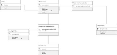
This is my datamodel (competences = competenties, knowledges = kennisgebieden) It's in Dutch sorry...
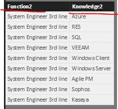
For example i have the following data
The 2 tables on the left show the current knowledges and competences of Employee 1 in his current function System engineer 1st line,
The table on the right shows the knowledges someone need to be a System engineer 3rd line.
What i wnat for output is a graph which show me some kind a growing path, so wat knowledges needs the employee to learn to become a 3rd line s.e., the fact is i don't know how to show this in a graph
I hope it made it more clear now?
- Mark as New
- Bookmark
- Subscribe
- Mute
- Subscribe to RSS Feed
- Permalink
- Report Inappropriate Content
Hi @miltenburger,
I used below sample to test. I renamed some field names in order to distinguish.
Create a calculated table.
New table_1 = CROSSJOIN(VALUES('Employee Knowledge'[Employee]),'Function Knowledge')
Based on 'New table_1' and 'Employee Knowledge', filter out those unmatched records which shows knowledges an employee have to learn to become a 3rd line.
New table_2 =
EXCEPT (
    SELECTCOLUMNS (
        'New table_1',
        "EmployeeNo2", 'New table_1'[Employee],
        "Knowledge2", 'New table_1'[Knowledge2]
    ),
    SELECTCOLUMNS (
        'Employee Knowledge',
        "EmployeeNo", 'Employee Knowledge'[Employee],
        "Knowledge1", 'Employee Knowledge'[Knowledge1]
    )
)
I would suggest you use a table visual to display above information. A chart cannot show knowledge details, while it can show how many knowledge an employee need to learn in the future.
Best regards,
Yuliana Gu
If this post helps, then please consider Accept it as the solution to help the other members find it more quickly.
- Mark as New
- Bookmark
- Subscribe
- Mute
- Subscribe to RSS Feed
- Permalink
- Report Inappropriate Content
Thanks @v-yulgu-msft,
I didn't think about that in this way, i think i can work around with this!
Thanks for the assist.
- Mark as New
- Bookmark
- Subscribe
- Mute
- Subscribe to RSS Feed
- Permalink
- Report Inappropriate Content
Hi @miltenburger,
What is data model? Please provide detailed sample data. What is your desired output? Please provide more description about your report. If possible, use an image to illustrate your requirement.
Regards,
Yuliana Gu
If this post helps, then please consider Accept it as the solution to help the other members find it more quickly.
Helpful resources

Microsoft Fabric Learn Together
Covering the world! 9:00-10:30 AM Sydney, 4:00-5:30 PM CET (Paris/Berlin), 7:00-8:30 PM Mexico City

Power BI Monthly Update - April 2024
Check out the April 2024 Power BI update to learn about new features.

| User | Count |
|---|---|
| 109 | |
| 99 | |
| 77 | |
| 66 | |
| 54 |
| User | Count |
|---|---|
| 144 | |
| 104 | |
| 101 | |
| 86 | |
| 64 |


