- Power BI forums
- Updates
- News & Announcements
- Get Help with Power BI
- Desktop
- Service
- Report Server
- Power Query
- Mobile Apps
- Developer
- DAX Commands and Tips
- Custom Visuals Development Discussion
- Health and Life Sciences
- Power BI Spanish forums
- Translated Spanish Desktop
- Power Platform Integration - Better Together!
- Power Platform Integrations (Read-only)
- Power Platform and Dynamics 365 Integrations (Read-only)
- Training and Consulting
- Instructor Led Training
- Dashboard in a Day for Women, by Women
- Galleries
- Community Connections & How-To Videos
- COVID-19 Data Stories Gallery
- Themes Gallery
- Data Stories Gallery
- R Script Showcase
- Webinars and Video Gallery
- Quick Measures Gallery
- 2021 MSBizAppsSummit Gallery
- 2020 MSBizAppsSummit Gallery
- 2019 MSBizAppsSummit Gallery
- Events
- Ideas
- Custom Visuals Ideas
- Issues
- Issues
- Events
- Upcoming Events
- Community Blog
- Power BI Community Blog
- Custom Visuals Community Blog
- Community Support
- Community Accounts & Registration
- Using the Community
- Community Feedback
Register now to learn Fabric in free live sessions led by the best Microsoft experts. From Apr 16 to May 9, in English and Spanish.
- Power BI forums
- Forums
- Get Help with Power BI
- Desktop
- Auto scale on line charts "freaks out" when graphi...
- Subscribe to RSS Feed
- Mark Topic as New
- Mark Topic as Read
- Float this Topic for Current User
- Bookmark
- Subscribe
- Printer Friendly Page
- Mark as New
- Bookmark
- Subscribe
- Mute
- Subscribe to RSS Feed
- Permalink
- Report Inappropriate Content
Auto scale on line charts "freaks out" when graphing constant decimal data
Visualization: Linear line chart with y-axis scale start/end set to auto.
I'm trying to graph decimal data that is derived using the DAX DIVIDE() function (in SSAS). I have configured my resulting data to have 2 decimal places. If I show data for multiple data sets (customers in this case), the scale displays correctly.
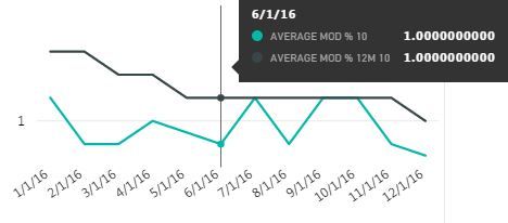
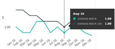
If, however, I slice down to a single customer whose data happens to not vary over the selected time scale, the auto scaling algorithm doesn't come up with reasonable start & end points. The only scale marker that shows is that of something close to my value (e.g., 1.00). But what should be a straight line is wildly crooked. The tooltip correctly reports each data point as 1.00, but the line is drawn up, down & all over the place.
I suspect the scale is being set to nano proportions, and 1.00 might be being treated as 1.0000001 sometimes, 0.90000004 sometimes, etc. (Leading me to think that while I've set the precision to 2 decimal places, the internal precision is much greater. However, the same two numbers are being divided in each case, so you'd think they return the same result.)
I would insert an image if I could figure out how to do so - I don't think what I've inserted below will work:
Solved! Go to Solution.
- Mark as New
- Bookmark
- Subscribe
- Mute
- Subscribe to RSS Feed
- Permalink
- Report Inappropriate Content
If you change the decimal places to 9 or 10 instead of 2, can you see there is any difference in the tooltip for the values?
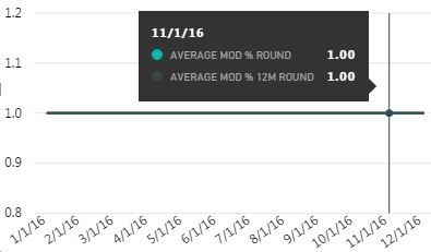
BTW, if you use DAX ROUND() function to round the divide result to 2 decimal places, will the chart change?
Best Regards,
Herbert
- Mark as New
- Bookmark
- Subscribe
- Mute
- Subscribe to RSS Feed
- Permalink
- Report Inappropriate Content
Your second tactic is an effective work-around.
The first tactic shows 1.0 out to 10 decimal places.
Thanks, Herbert!
- Mark as New
- Bookmark
- Subscribe
- Mute
- Subscribe to RSS Feed
- Permalink
- Report Inappropriate Content
If you change the decimal places to 9 or 10 instead of 2, can you see there is any difference in the tooltip for the values?
BTW, if you use DAX ROUND() function to round the divide result to 2 decimal places, will the chart change?
Best Regards,
Herbert
- Mark as New
- Bookmark
- Subscribe
- Mute
- Subscribe to RSS Feed
- Permalink
- Report Inappropriate Content
The connection mode is Live Connection.
- Mark as New
- Bookmark
- Subscribe
- Mute
- Subscribe to RSS Feed
- Permalink
- Report Inappropriate Content
What is the connection mode here, Direct Query or Import? Could you please repost the screenshot since it cannot be displayed properly.
Best Regards,
Herbert
Helpful resources

Microsoft Fabric Learn Together
Covering the world! 9:00-10:30 AM Sydney, 4:00-5:30 PM CET (Paris/Berlin), 7:00-8:30 PM Mexico City

Power BI Monthly Update - April 2024
Check out the April 2024 Power BI update to learn about new features.

| User | Count |
|---|---|
| 109 | |
| 99 | |
| 77 | |
| 66 | |
| 54 |
| User | Count |
|---|---|
| 144 | |
| 104 | |
| 102 | |
| 87 | |
| 64 |


